Python 繪製折線圖 Plot Line Charts
matplotlib.pyplot module提供許多繪圖指令(與matlab語法非常相近),這邊介紹繪製折線圖相關的指令
reference: https://matplotlib.org/users/pyplot_tutorial.html
在使用前,一樣要先import matplotlib.pyplot module (為了方便使用numpy arrays,也一起import numpy module)
import numpy as np
import matplotlib.pyplot as plt
plt.plot plot a line chart 畫折線圖
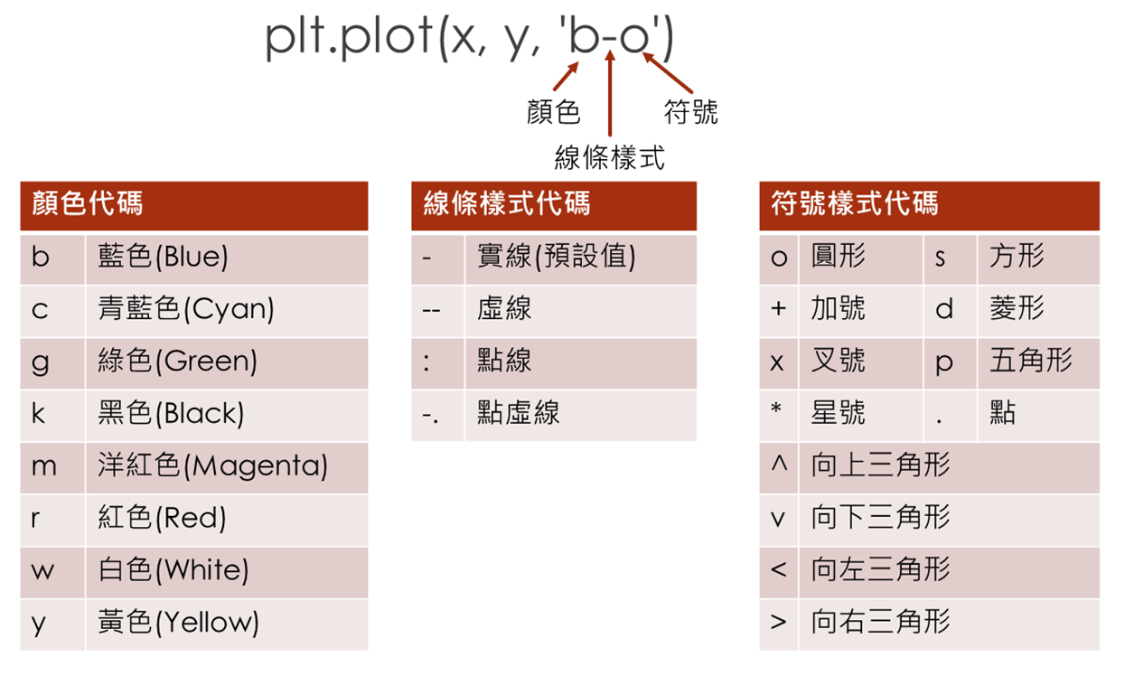
plt.plot(x, y, 'style_code')
- x: position along the x-axis (if missing, than use integers 0,1,2,3.... as default)
- y: position along the y-axis
- 'style code': abbreviation code for line color, line style, and marker style (see tables below)
還有很多可以設定的選項,詳細請參考 https://matplotlib.org/api/_as_gen/matplotlib.pyplot.plot.html#matplotlib.pyplot.plot
line style and marker code
- line style: https://matplotlib.org/api/lines_api.html
- color code: https://matplotlib.org/api/colors_api.html
- marker style: https://matplotlib.org/api/markers_api.html
#Example 1 Plot cos(x) between 0 and 2*pi
x = np.linspace(0.0, 2*np.pi)  # 50x1 array between 0 and 2*pi
y = np.cos(x)                  # cos(x)

plt.plot(x, y, 'r')   # red line without marker
plt.show()
plt.plot(x, y, 'b-o') # blue solid line with filled circle marker
plt.savefig('fig1.png')
plt.show()


一張圖有多條線 Plot multiple lines in one figure
把要畫的x座標陣列與y座標陣列一組一組建立好
每一組x與y陣列長度要相同,但是各組之間可以不同
依序plot各組x,y陣列(python會自動使用不同顏色的多條曲線,也可自行設定線條顏色樣式)
每組都畫完之後,再用plt.show()顯示在同一張圖中
# Example: plot cos(x), sin(x), and sinc(x) in the same figure
x1 = np.linspace(0, 2*np.pi)    # 50x1 array between 0 and 2*pi
y1 = np.cos(x1)
x2 = np.linspace(0, 2*np.pi,20) # 20x1 array
y2 = np.sin(x2)
x3 = np.linspace(0, 2*np.pi,10) # 10x1 array
y3 = np.sinc(x3)

plt.plot(x1, y1, 'k--+')   # black dashed line, with "+" markers
plt.plot(x2, y2, 'gd')     # green dimonds (no line)
plt.plot(x3, y3, 'r:')     # red dotted line (no marker)
plt.show()

Add title, axis lables 加標題、座標軸文字
利用以下指令,可以在圖的不同位置加上文字
plt.title('string',fontsize=n): 加標題
plt.xlabel('string',fontsize=n): 加x軸文字
plt.ylabel('string',fontsize=n): 加y軸文字
plt.text(xp, yp, 'string',fontsize=n): 在圖上xp, yp的位置寫字
在這些指令中,要顯示的字串要用''夾起
在字串中插入希臘字母、上標、下標
\$\alpha\$ ⟹ 𝛼
\$\alpha \beta\$ ⟹ 𝛼𝛽 (\$\$之間的空格會被忽略)
\$\alpha\$ \$\beta\$ ⟹ 𝛼 𝛽 (字母間如果要插空格,必須分別用\$\$夾住)
上標superscript:\$T^{20}\$ ⟹ $T^{20}$
下標subscript: \$T_{20}\$ ⟹ $T_{20}$
#Example of adding title, axies labels, and text string
plt.plot(x3, y3, 'r:')     # red dotted line (no marker)
plt.xlabel('X')
plt.ylabel('Y')
plt.title(r'sinc(x) between 0 and 2$\pi$')
plt.text(3,0.5,'example',fontsize=18)
plt.show()

Change the range of axes and tick marks 設定座標軸範圍、刻度
自訂座標軸刻度與刻度上的標記文字
plt.xticks([array of tick marks],[list of tick mark labels]) :x軸刻度、標記
plt.yticks([array of tick marks],[list of tick mark labels]) :y軸刻度、標記
例如: plt.xticks(np.linspace(0,5,3),[' zero ', ' 5/2', ' five'])
注意:plt.xticks要寫在plt.xlim或plt.ylim之前,否則會被xlim的設定蓋過
座標軸範圍
plt.xlim([xmin,xmax]) x軸的上、下界
plt.ylim([ymin,ymax]) y軸的上、下界
注意:Python 會自動根據上下界的順序自動反轉座標,例如:plt.xlim([xmax,xmin]) 會自動讓X軸高值在左側、低值在右側
# Example of setting axes range and tick marks
plt.plot(x3, y3, 'r:')     # red dotted line (no marker)
plt.xticks(np.linspace(0,5,11))
plt.xlim([0,5])
plt.ylim([-1,1])
plt.show()

# change x tick mark lables
plt.plot(x3, y3, 'r:')     # red dotted line (no marker)
plt.xticks(np.linspace(0,5,11),['a','b','c','','e','','g'])
plt.xlim([0,5])
plt.ylim([-1,1])
plt.show()

Use logarithmic axes 使用對數座標軸
Python 預設使用線性座標(linear),要調整為對數座標(log)使用:
plt.xscale('log') 對數x軸
plt.yscale('log') 對數y軸
# Example of setting log axis
plt.plot(x3, y3, 'r:')     # red dotted line (no marker)
plt.xlim([0.1,10])
plt.xscale('log')          # log x-axis
plt.show()

plt.legend -- add a legend 加上圖例說明
圖中有許多線條的時候,在圖上加入圖例說明(legend)會更清楚瞭解每條線的意義。
plt.legend([list of legend text],loc='location')
- 'location'設定legend在圖中的位置:
- ‘best’,
- ‘upper right’,
- ‘upper left’, ‘lower left’, ‘lower right’, ‘right’, ‘center left’, ‘center right’, ‘lower center’, ‘upper center’, ‘center’
plt.legend還有許多可以調整的設定,詳細請參考 https://matplotlib.org/api/_as_gen/matplotlib.pyplot.legend.html#matplotlib.pyplot.legend
#example of adding legend
plt.plot(x1, y1, 'k--+')   # black dashed line, with "+" markers
plt.plot(x2, y2, 'gd')     # green dimonds (no line)
plt.plot(x3, y3, 'r:')     # red dotted line (no marker)
plt.legend(['cos($\phi$)','sin($\phi$)','sinc($\phi$)'])
plt.show()

plt.subplot -- split window to show multiple figures 切割視窗顯示多張圖
在同一個視窗畫出mxn張小圖
f,ax=plt.subplots(m, n, sharex='...', sharey='...') 分割畫面並設定共用座標軸
- m: 垂直方向的圖形數目
- n: 水平方向的圖形數目
- sharex & sharey: 圖形之間是否要共用x軸或y軸,'...'內可填入的選項有
- 'col': 直行的圖共用
- 'row':橫列的圖共用
- 'all': 所有的小圖都共用
- 'false': 不共用 (default setting)
ax[a,b].plot(...) 會在[a,b]區塊畫圖,排列方式如下
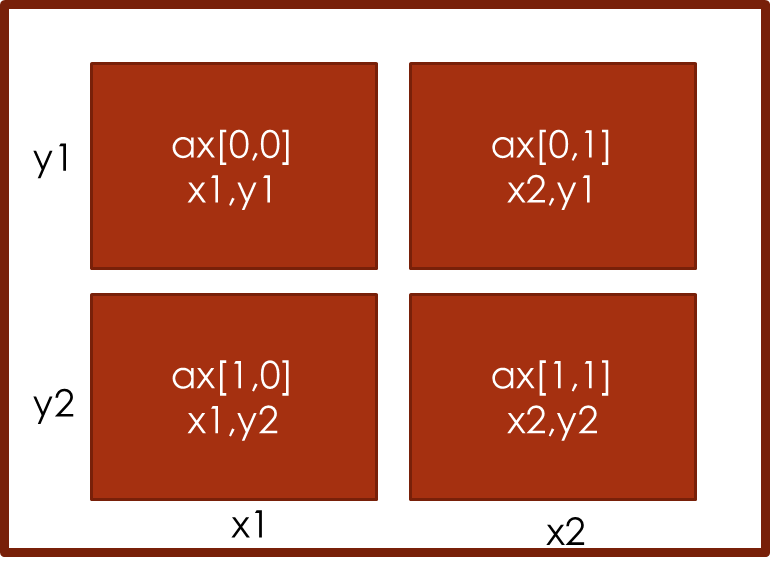
ax[a,b].set_title('....') 在 [a,b]區塊加標題
ax[a,b].set_xlabel('....') 在 [a,b]區塊加x軸文字
# example of plot 2x2 figures in the same window

import numpy as np
import matplotlib.pyplot as plt

# generate x and y array
x=np.linspace(1,100)
y=1/np.exp(x)

# split window
f, ax = plt.subplots(2,2,sharex='col',sharey='row')
#upper left
ax[0,0].plot(x,y)
ax[0,0].set_title(r'1/$e^{x}$, both linear')
ax[0,0].set_ylabel('y')

#upper right
ax[0,1].plot(x,y)
ax[0,1].set_title(r'1/$e^{x}$, log x')

#lower left
ax[1,0].plot(x,y)
ax[1,0].set_yscale('log')
ax[1,0].set_title(r'1/$e^{x}$, log y')
ax[1,0].set_xlabel('x')
ax[1,0].set_ylabel('log(y)')
ax[1,0].set_xticks(np.linspace(0,20,11))
ax[1,0].set_xlim([0,20])

#lower right
ax[1,1].plot(x,y)
ax[1,1].set_xscale('log')
ax[1,1].set_title(r'1/$e^{x}$, log-log')
ax[1,1].set_xlabel('log(x)')
#save figure and show
plt.savefig('2x2_subplot.png')
plt.show()
